The Landing Page and the Thank You Page: The Only Two Pages You Need to Start
 Digital PratikGrowth Marketing Consultant
 You need two pages and no more to start.
A landing page with a hook, a short headline and subheadline, a video, and a single button.
Then a thank you page, which is the page almost everybody wastes.
Build both simple deliberately: extra sections do not add persuasion, they add places for a visitor to stall.
When I build one of these now I build it in an evening, and the structure has got simpler every year rather than more elaborate. That is not laziness, it is what the data kept saying.
The landing page, in order
Top to bottom, this is the whole thing.
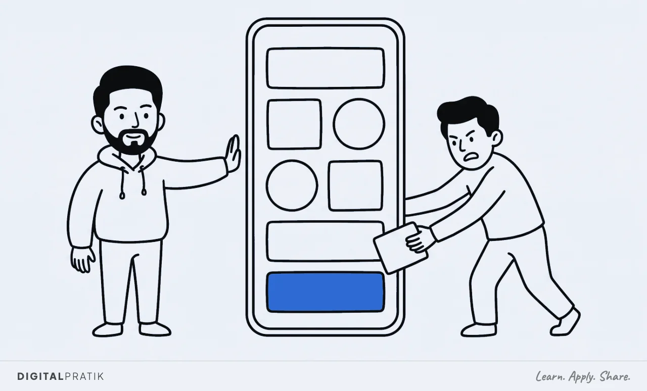
- The hook. The line that stops them. This is doing most of the work on the page.
- A short headline and subheadline. What it is and who it is for, quickly.
- A video. You, talking, briefly. This is where the show don't tell part lives.
- One button. One. Not one plus a secondary option plus a link in the footer.
That is it, and the restraint is the point. I do not want to confuse people with more.
Every additional section is another opportunity for someone to think about it rather than act, and thinking about it is not a step toward buying.
Why a video rather than more copy
Because the video is the proof. Text describes, video demonstrates, and the demonstration is the reason they should believe you at all.
It does not need production. It needs to be you, actually explaining the thing, in a way that shows you know it.
That is the same proof logic as the show-and-not-tell funnel. A slightly rough video of someone who clearly does this for a living outperforms a polished one that says nothing, and it always has.
Design for the phone, because that is where they are
Nine out of ten people who see this page will see it on a phone. That is not a detail to check at the end, it is the primary design target.
Practically it means the hook has to work in a small space above the fold, the button has to be reachable with a thumb, and anything clever that only makes sense on a wide screen is decoration for the ten percent. Build the phone version and let the desktop version be the adaptation, not the other way round.
How to actually build it fast
Two things make the difference between an evening and a fortnight.
First, give the AI a reference. Point it at a page whose structure you want, either one of your own or one you have reverse engineered, and tell it to use your brand system: your fonts, your colours, your existing site.
A blank instruction produces a generic page. A reference plus a brand system produces something that looks like it belongs to you.
Second, work inside a project that already holds your context rather than a fresh conversation each time. If your brand, your files and your previous work are already loaded, you do not re-explain your business every session, and the output is better because it is not guessing.
Reading about a system and running one are different jobs. If your business does AED 10 million a year or more, this is what a working session looks like.
The thank you page is not a receipt
This is the page people build in four minutes and then never think about again, and it is the most valuable real estate in the entire funnel.
Think about who is looking at it. Somebody who just said yes.
They have the highest intent they will ever have, they are already in motion, and the overwhelming majority of businesses use that moment to display the words thank you and a download link.
At minimum, put a video of yourself on it. They just took a small risk on you and the natural next question is who exactly did I just give my details to.
Answer it, on camera, in under a minute.
What I put on mine
On a paid front end, the thank you page is where I set up the human contact. It tells the buyer that we schedule an optional one to one conversation before the thing they bought, and it frames what that conversation is: not a sales call, a chance for me to understand their business.
Then I phone them. The page has already introduced the idea, so the call is expected rather than intrusive, which changes the entire tone of it.
The full mechanics of that are in the knowing call.
That is the difference between a thank you page and a receipt. One ends a transaction.
The other starts a relationship, using the one moment when the person is most willing to have one started.
The hook is doing most of the work
If you are going to spend disproportionate time on one element, spend it here. Everything below the hook only gets read by people the hook already stopped.
A good one names a specific situation the reader recognises as theirs. A bad one describes what the thing is.
Nobody arrives caring what it is, they arrive wondering whether it is about them, and the hook answers that question in about a second.
Write ten and pick one. The first three will be descriptions rather than hooks, which is normal and is why you write ten.
Check it on a real phone before you spend anything
Not the desktop browser resized, an actual phone. Things break on real devices that look perfect in a simulated narrow window.
Load it on mobile data rather than office wifi, because your visitors will. Then check the obvious: does the hook land above the fold, does the video play without a fight, is the button reachable with a thumb, and does anything scroll sideways.
A page that fails any of those is losing traffic you have already paid for, silently.
What not to add
You will be tempted to add testimonials, a frequently asked questions block, a comparison table, a founder story and three more sections, because every page you admire has them.
Those pages have them because they earned the right through testing, and because they are usually selling something more expensive to a colder audience. At the start, every one of those sections is a place to stall.
Ship the two simple pages, get real traffic on them, and let the data tell you what is genuinely missing.
Two pages. Then go and get traffic, which is where most of the actual work is anyway.
Frequently asked questions
A hook, a short headline and subheadline, a video of you, and a single call to action button. Nothing else at the start. Additional sections rarely add persuasion and reliably add places for a visitor to hesitate, and hesitation is not a step toward converting.
Because a second option converts an action into a decision. The visitor arrived with momentum and every extra choice slows it. One button, repeated if the page is long, outperforms a primary and secondary option in almost every case worth having.
Yes. Roughly nine in ten visitors will arrive on a phone, so the phone layout is the primary design and the desktop version is the adaptation. Anything that only makes sense on a wide screen is decoration for a small minority of your traffic.
Something other than the words thank you. The person looking at it has the highest intent they will ever have, so at minimum put a short video of yourself introducing who they just gave their details to. On a paid front end it is also the right place to set up a personal conversation before delivery.
Give it a reference page whose structure you want plus your actual brand system, fonts, colours and existing site, and work inside a project that already holds your business context rather than starting a fresh conversation each time. A blank prompt produces a generic page every time.
Install this in your business
An article gives you the map. A working session gives you the system, built around what you actually sell and who actually buys it.