You need 2 pages to start. Not a whole website.
You do not need a website to start. You need 1 landing page and 1 thank you page. That is the whole thing.You do not need a website to start. 1 landing page and 1 thank you page is the whole thing.

- The landing page is 5 parts: a hook, a headline, a subheadline, a video, 1 button. Stop there.
- A second button is not a second chance. It is a decision you just handed the visitor.
- 9 out of 10 people will see your page on a phone, so build the phone version first.
- The thank you page is the most wasted page in most funnels, and the most valuable.
- Give the AI a reference page and your brand, never a blank instruction.
In this article
When I build these 2 pages now, I build them in 1 evening. And every year the pages get simpler, not bigger. That is not me going easy on the work. That is what the numbers kept telling me.
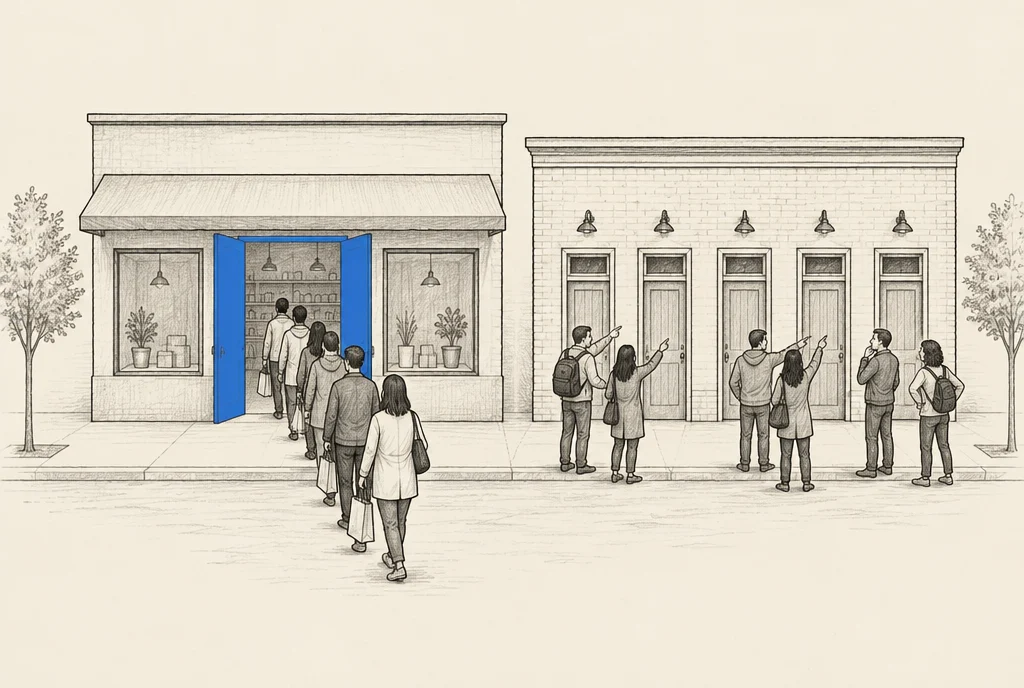
Most owners who want leads start by asking for a website. 8 pages, a menu, an about page, a blog. Then 3 months pass and nothing has been sold. You do not need any of that to start. You need 1 landing page and 1 thank you page.
And this matters more now than it did before. People do not only type your name into Google. Many of them ask a chatbot who to hire, then click 1 link and decide in a few seconds. That 1 link had better be a page that gets to the point.
01The landing page, top to bottom
This is the whole page, in order. There is nothing under it.
What goes on the landing page
- 01The hook
The 1 line that stops them. This does most of the work on the page.
- 02The headline
What the thing is, in a few words.
- 03The subheadline
Who it is for, in 1 more line.
- 04A video
You talking, briefly. This is where you show instead of claim.
- 051 button
1. Not 1 button plus a smaller option plus a link at the bottom.
That is it, and stopping there is the point. I do not want to confuse people with more. Every extra block is 1 more place for a person to think about it instead of doing it, and thinking about it is not a step towards buying.
A second button is not a second chance. It is a decision you just handed the visitor, and the most common thing anybody does with a decision is leave it for later.
Almost every landing page that fails is one somebody kept adding to.
02Why a video and not more words
People ask me why the page is not full of writing. Because writing describes and a video shows. The video is the proof, and proof is the only reason a stranger should believe you.
It does not need a crew or lights. It needs you, actually explaining the thing, in a way that makes it obvious you do this for a living. A slightly rough video of someone who clearly knows the work beats a polished video that says nothing. It always has.
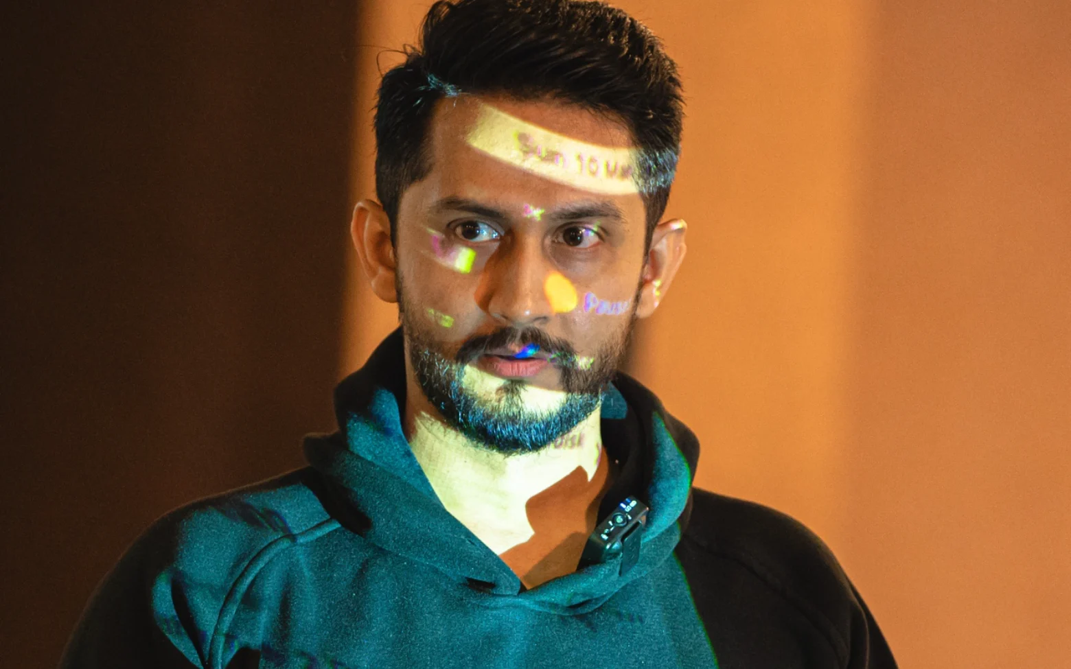
Keep it short. The person watching is standing somewhere, holding a phone, with 1 question in their head. Can this person actually help me. Answer that and stop talking.
039 out of 10 are on a phone
9 out of 10 people who see this page will see it on a phone. That is not a detail you check at the end. That is the main design.
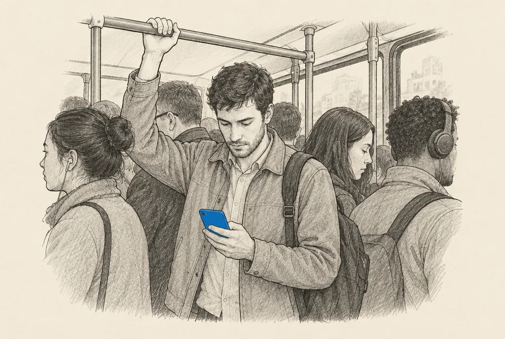
So the hook has to land in a small space at the top, before any scrolling. The button has to sit where a thumb can reach. Anything clever that only works on a wide screen is decoration for the other 1 in 10. Build the phone version and let the laptop version follow it, not the other way round.
Then open it on a real phone, not a laptop window squeezed narrow. Things break on real phones that look perfect in a narrow window. Open it on mobile data too, because that is what your visitors are on.
The real phone test
- The hook is readable without scrolling.
- The video plays on the first tap.
- The button is easy to reach with a thumb.
- Nothing slides sideways.
- It loads on mobile data, not only on office wifi.
A page that fails any of those is losing traffic you already paid for, and it loses it quietly.
04How I build both in 1 evening
2 things turn this from a 2 week job into 1 evening.
First, give the AI a reference. Point it at a page whose shape you want, one of your own or one you have studied, and tell it to use your brand: your fonts, your colours, your existing site. A blank instruction gives you a generic page. A reference plus your brand gives you a page that looks like it belongs to you.
What you hand the AI
A generic page
A page that looks like yours
Whatever it picks
Yours
Many
Few
Weeks
1 evening
Second, work inside a place that already holds your context, not a fresh chat every morning. For us that place is the command center we build for a business, the AiOS. The brand, the files, the old pages and the past work sit in 1 company brain, and the Telegram assistants read from the same brain. You stop explaining your business every session, and the output is better because it is not guessing. We run our own Dubai client work this way.
There is a money reason too. 1 long chat gets slower and costs more, because everything said earlier gets read again on every turn. Keeping your context in 1 place instead of 1 never ending chat is cheaper, and what comes out stays more the same.
05The thank you page is not a receipt
This is the page people build in 4 minutes and then never think about again. It is the most valuable space in the whole path from the ad to the sale.
Think about who is standing on it. Somebody who just said yes. They will never trust you more than they do in that second. Their details are already in your hands and their full attention is on your page. And most businesses answer that moment with the words thank you and a download link.
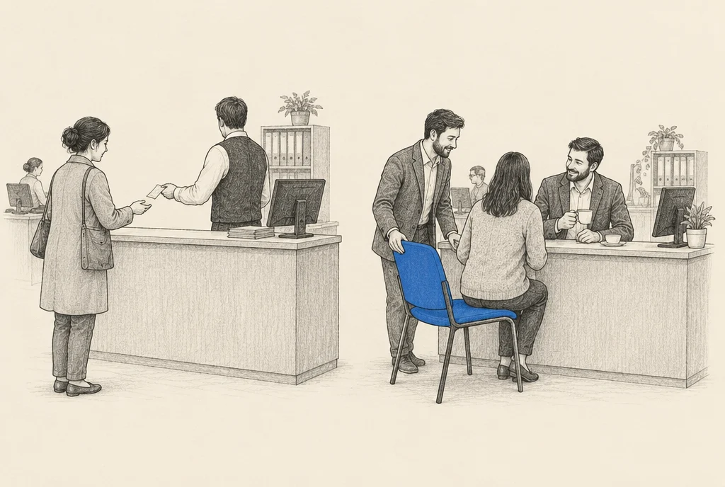
A receipt ends a sale. A thank you page can start a relationship.
At the very least, put a video of yourself on it. They just took a small risk on you, and the first question in their head is simple. Who did I just give my details to. Answer it, on camera, in under 1 minute.
On a paid page, my own thank you page sets up the human contact. It tells the buyer that we will have an optional one to one talk before the thing they bought, and it says plainly what that talk is: not a sales call, a chance for me to understand their business.
Then I phone them. The page has already introduced the idea, so the call is expected instead of annoying, and that changes the whole tone of it. That is the difference between a thank you page and a receipt. One closes a sale. The other opens a relationship, at the 1 moment the person is most willing to have one opened.
06The hook, and what not to add
If you are going to spend extra time on 1 thing, spend it on the hook. Everything under the hook is only read by the people the hook already stopped.
A good hook names a situation the reader knows is theirs. A weak one describes what the thing is. Nobody arrives caring what it is. They arrive asking whether it is about them, and the hook answers that in about 1 second.
Write 10 and pick 1. The first 3 will come out as descriptions and not hooks. That is normal, and it is the reason you write 10.
Now the part that will tempt you. You will want to add reviews, a questions block, a comparison table, your story and 3 more sections, because every page you admire has them. Those pages earned those sections by testing, and they are usually selling something more expensive to people who have never heard of them. At the start, each one of those blocks is 1 more place to stall. Ship the 2 simple pages, get real traffic on them, and let the numbers tell you what is actually missing.
- 2pages you need to start
- 1button on the landing page
- 9 in 10visitors who see it on a phone
- 10hooks you write to find 1
Build the 2 pages in 1 sitting, open them on your own phone on mobile data, then put a 1 minute video of yourself on the thank you page.
07Questions, answered
Do I still need a website?
Not to start. A website helps later, for people who already know your name and want to look you up. To get leads this month, 1 landing page and 1 thank you page is enough.
How long should the video be?
Short. On the landing page, long enough to show you know the work and no longer. On the thank you page, under 1 minute.
Can I use 2 buttons if they do the same thing?
The same button repeated lower down the page is fine. A second different option is not. That is a decision, and people postpone decisions.
My page is live and getting no leads. What do I change first?
The hook. It does most of the work on the page, so it is the thing most likely to be wrong. Change it before you add any sections.
Do I need a designer for the thank you page?
No. A line that sets up the next step and a short video of you beats a designed page that says thank you and nothing else.
If you want these 2 pages and the system behind them built for your business, book a consulting call with Digital Pratik and we will start from what you already have.

Digital PratikA 37 year old, smiling, practical Gujarati, a Kathiyawadi businessman. Founder of JorrDaar LLC, Dubai.